When people travel, they may be happy—or not—depending on the mode they use, trip duration, and other factors. A team of U researchers has created an interactive map that illustrates differences in travelers’ happiness ratings on streets and roads in the Minneapolis–Saint Paul metro area.
“Happiness is increasingly seen as a gauge of an individual’s well-being, and this has many social implications,” says Professor Yingling Fan of the Humphrey School of Public Affairs, the principal investigator.
The Transportation Happiness Map is the latest effort led by Fan to explore happiness as a useful metric to assess transportation systems and guide policymaking, supplementing more common measures such as mobility and accessibility. The work was funded by CTS.
“Transportation is an emotional landscape people cannot avoid,” Fan says. “It is more than a means of getting from place to place. People spend significant time every day in transportation, and a significant amount of land area in our cities is dedicated to transportation-related facilities. Livable transportation solutions need to maximize both system efficiency and user experience.”
The map makes self-reported emotional experience data easily accessible through visualization. Users can select among 10 travel mode options (such as driving or biking), 7 time options, 8 emotion options (including stressed or tired), and two statistic options.
The data powering the map were collected using the Daynamica smartphone application. Daynamica is based on patented technology developed by a team of faculty and students led by Fan. It detects activities and trips in real time and allows users to annotate the detected data with information such as emotional experiences.
The team collected data from 398 residents from six neighborhoods in the region, including four urban and two suburban areas. Each resident contributed a week of trip data in 2016 or 2017.
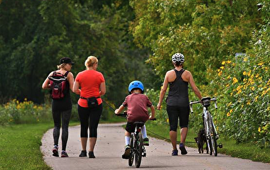
“Overall, biking-based transportation happiness levels are higher than the levels associated with other modes,” Fan says, noting that the map is exploratory in nature. A close-up example in downtown Minneapolis shows that South 8th Street and South 4th Street have the least happy levels while South 2nd Street and 3rd Avenue South have the happiest.
“For policymakers interested in improving people’s transportation happiness, the map provides important insights on road and street segments that may need closer investigation for future improvements,” she adds.